Nova for Good
Establishing our online presence | UI/UX and design system for web
Role Duration
Lead Designer & PM Jun to Sep 2020
Team

Process
1. Discover → ideation sessions, focus group, info architecture
2. Define → problem definition
3. Ideate & Iterate → low-fidelity wireframes, high-fidelity wireframes
4. Deliver → prototype for developers, our final product of Nova's very own website 🎉
Organizations have identity crises too
Nova for Good is a team of UCLA students who create high-impact technology for nonprofits serving their communities. As a newly established club, it was critical that our visual identity and digital presence be representative of us and robust we scaled.
At the time, we only had a hastily assembled Notion that didn't express much of our personality or culture. Being a team of designers and developers, we had to build our own website to show what we could do and who we were.
Challenge
How can we improve Nova's online presence and visual identity?
This case study focuses on our work on Nova's online presence specifically. Goals for potential solutions were:
1. Students knowing who we are, what we do, and wanting to join us after viewing the site
2. Nonprofits knowing who we are, what we do, and wanting to work with us after viewing the site
3. Increased digital presence marked via more visitors to our website
Discover
Validating the problem
To check if this redesign was needed, we conducted UXR via focus group of newer members to see what their first impressions of Nova were, which boiled down to "a little clunky".
Even worse, they weren't sure of what values we had other than "tech for social good". Finally, our site wasn't actionable; we had nothing on how to join or how to reach us.
Define
Based on our findings, we refined our initial challenge into this:
How can we make Nova's online presence and visual identity more representative of who we are and what we do?
Ideate & Iterate
Our next step was to discuss our identity and values together—what ideas Nova stands for and embodies everything it does. After establishing this, we then had our first conversation and ideation session about the website.

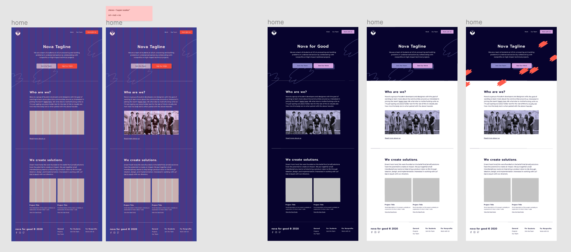
Artifact from ideation session showing 1) content and 2) how content/the overall site would be organized
Following this, we started on lo-fi wireframes, many of which were done by Sam Chai. Future iterating was split evenly amongst all of us, with no large structural changes.

Desktop web
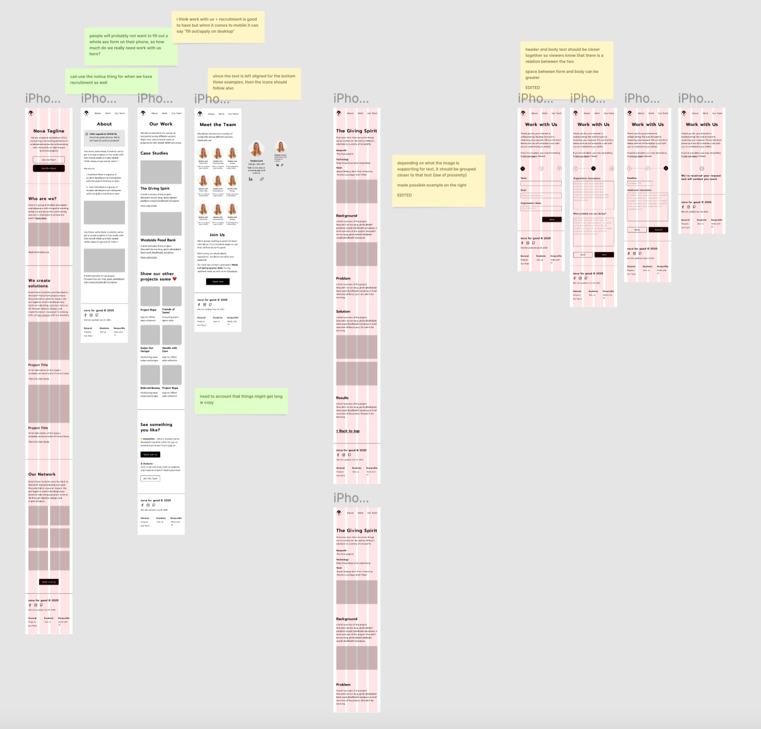
Mobile web
Once lo-fi was finalized, we moved into hi-fi. We got rid of the red-orange since it was too close to red. This makes elements of that color seem like they're in error, blocking key call-to-actions (CTAs) at worst and drawing away attention at best.
First round of hi-fi iterating
In our second round of hi-fi iterating, we decided on dark mode over light mode, playing around with layout and visual assets.
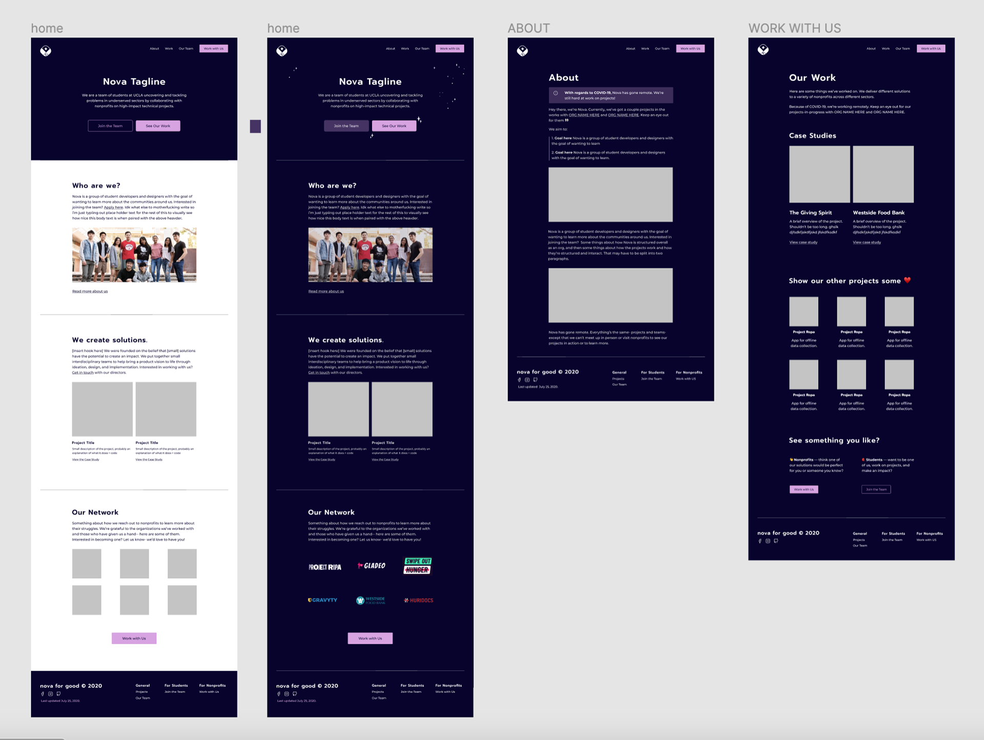
In our third and final round of hi-fi iterating, we finalized our colors, moving away from purple. This applied to the background as well, which had been a dark navy that we then reduced the saturation of. Yellow as our primary color brightens everything and introduces more warmth into our palette.

We also finalized visual assets to include, namely clouds on the homepage just above the fold and little stars in formerly negative space, which were present across all pages to a varying degree.
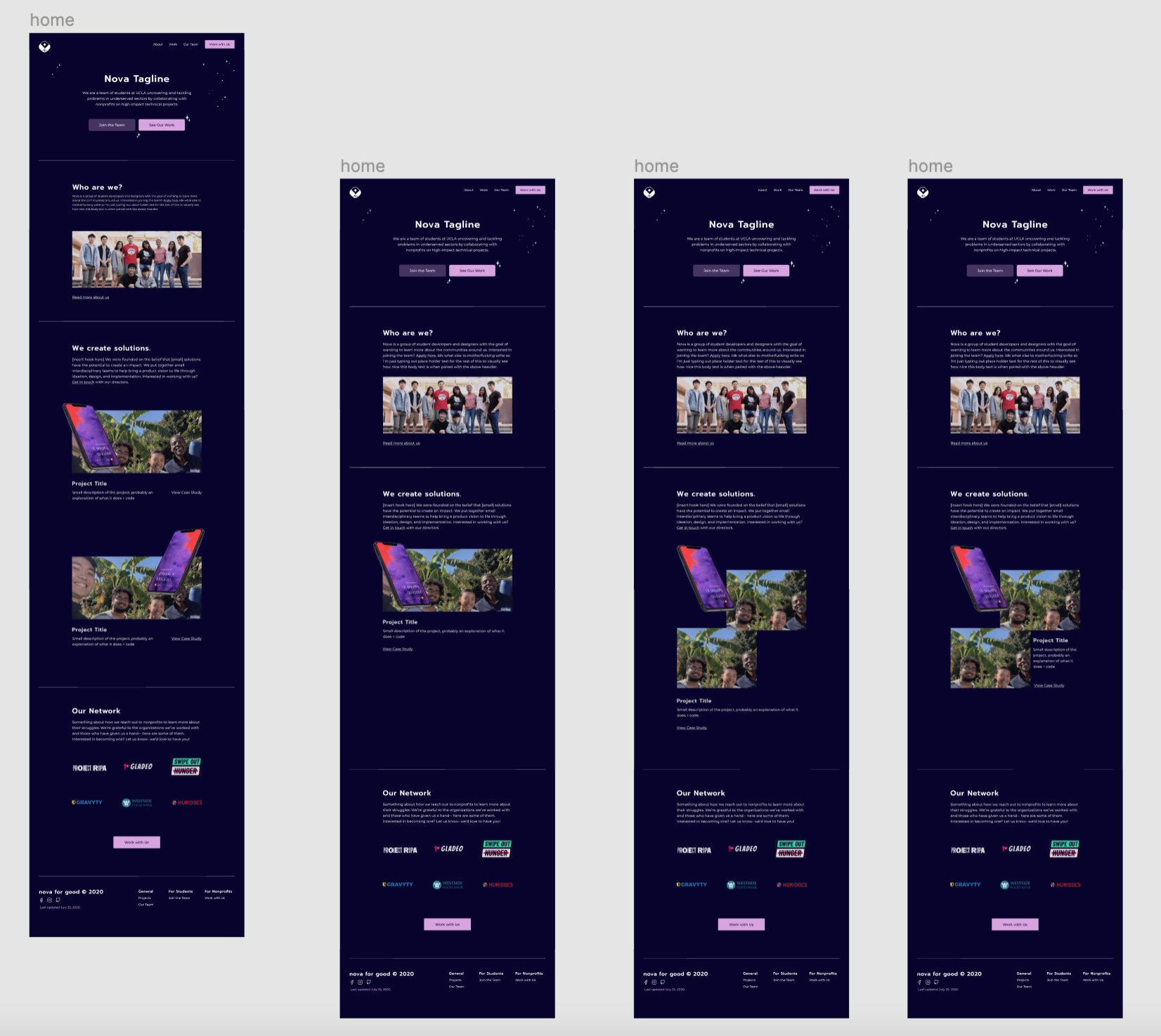
Delivery
I created a basic prototype in Figma and then handed off the file to our developer team.
However, there were a lot of interactions we wanted to have that we either couldn't create in Figma or felt that it wasn't worth the effort to do so. This meant there was lot of back-and-forth during implementation.
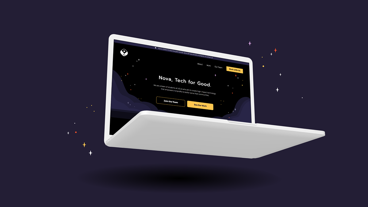
This is our final product.
Reflection
This was my second time rebranding an organization and redesigning its website, but it was my first time leading the effort and leading a larger team of developers and designers.
I definitely improved my delegating, explaining and advocating for certain design decisions, and facilitating design reviews, especially with developers. Most importantly, we successfully achieved all the goals we set out to accomplish! 🎉
There are definitely things I wish went differently or had been different, such as:
🔎 Feedback process during development. There was no structure unlike design review, so the entire team (dev, design, content) took a pause to review everything together.
Things I'm particularly proud of are:
🤔 Successfully defining the scope at the start. I created a reasonable timeline that we were able to stick to, even when unexpected issues popped up. However, this was also because this was a contained and new project; there was never any tech debt to deal with.
💬 Communication with developers. Problems were resolved quickly and easily with open channels that the whole team used to communicate.
While this write-up focuses on my product design work for this project, we also worked on Nova's visual identity too. You can explore final deliverables for that here.
If you'd like to talk about Nova, our work, nonprofits, or today's social issues, please reach out via email or via LinkedIn! I would love to hear from you.Thanks for reading!